


How to Create a Bootstrap Tooltip: Appearance, Direction, and Distance.
- A practical guide with real examples and tips to improve your web application usability.
- Uses Bootstrap 5.3.
Mar 5, 2026
Index
1. Introduction
When creating a website or a web application, it's common for a programmer to create a button and wonder: Will the user understand the icon on this button? Will they know what it's for?
In situations like this, the best solution is to create a tooltip — a small text box that appears when the user hovers the mouse pointer over the button.
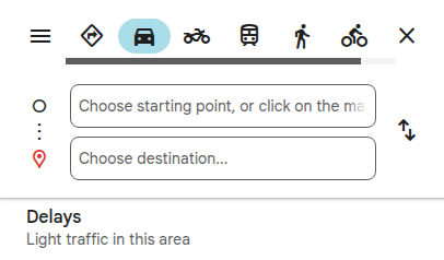
In pink, the user sees the Google Maps buttons.
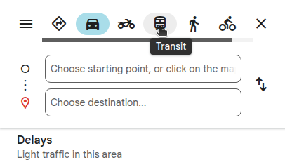
In green, the mouse pointer over the Transit button displays its tooltip.
Although it seems simple, creating a tooltip is not an easy task, because it requires knowledge of HTML, CSS, and JavaScript. In addition, you need to define its behavior and position in different contexts, which can vary depending on the screen size and resolution of the device.
Fortunately, there are some frameworks that make the process easier — and Bootstrap is one of the most popular ones.
Bootstrap is the most popular front-end framework used in web development. With Bootstrap, it is possible to create websites and web applications easily, quickly, elegantly, and responsively. In addition, Bootstrap is completely free and open source.

Bootstrap logo
(click to learn about the project)
(opens in a new tab)When I implemented my project portfolio (togtec.com.br), I found many articles, videos, and courses about how to create a Bootstrap tooltip. However, most of them show how to associate a tooltip with an HTML element (button or image) centered in the middle of the screen.
In this scenario, initializing the tooltip is enough — there is no need to worry about color, direction, or distance.
But in everyday situations, buttons are never alone — they belong to an application — and that's where the problems start!
If the buttons are part of a navigation bar, for example, it is necessary to adjust the tooltip distance so it does not overlap the bar.
Otherwise, if the navigation bar and the tooltip have the same color, it is necessary to change the tooltip background color so the user can see it.
In addition, when testing the website on a smartphone, the developer discovers that tooltips and touch screens do not work well together.
So, this article aims to go beyond the beginner level and answer the following questions:
- How to create a Bootstrap tooltip?
- How to define the direction? (top, right, bottom, and left)
- How to control the distance?
- How to modify the appearance? (background color, text color, and arrow removal)
- How to prevent tooltips from harming the user experience on mobile devices?
- How to configure a tooltip on a link that opens in a new tab?
2. Integrating Bootstrap into an HTML Page
Create an index.html file and include the <meta name="viewport"> tag (below, line 5) — to ensure responsive behavior on mobile devices.
<!doctype html>
<html lang="en-US">
<head>
  <meta charset="utf-8">
  <meta name="viewport" content="width=device-width, initial-scale=1">
  <title>Tog Portfolio - Everything you need to know about tooltips!</title>
</head>
<body>
  <h1>Bootstrap Tooltip Demo Page V1</h1>
</body>
</html>
test page v1
Include the CSS and the JavaScript:
- The CSS (<link> tag) must be placed inside the <head> tag (below, lines 9, 12, and 15).
- The JavaScript (<script> tag) must be placed before the </body> tag (below, lines 21 and 24).
<!doctype html>
<html lang="en-US">
  <head>
    <meta charset="utf-8">
    <meta name="viewport" content="width=device-width, initial-scale=1">
    <title>Tog Portfolio - Everything you need to know about tooltips!</title>

    <!-- Bootstrap CSS - file: bootstrap.min.css -->
    <link href="https://cdn.jsdelivr.net/npm/bootstrap@5.3.8/dist/css/bootstrap.min.css" rel="stylesheet" integrity="sha384-sRIl4kxILFvY47J16cr9ZwB07vP4J8+LH7qKQnuqkuIAvNWLzeN8tE5YBujZqJLB" crossorigin="anonymous">

    <!-- Custom CSS - file: main.css -->
  	<link rel="stylesheet" href="./app.style/main.css">

    <!-- Bootstrap Icons - file: bootstrap-icons.min.css -->
    <link rel="stylesheet" href="https://cdn.jsdelivr.net/npm/bootstrap-icons@1.13.1/font/bootstrap-icons.min.css">
  </head>
  <body>
    <h1>Bootstrap Tooltip Demo Page V2</h1>

    <!-- Bootstrap JavaScript - file: bootstrap.bundle.min.js -->
    <script src="https://cdn.jsdelivr.net/npm/bootstrap@5.3.8/dist/js/bootstrap.bundle.min.js" integrity="sha384-FKyoEForCGlyvwx9Hj09JcYn3nv7wiPVlz7YYwJrWVcXK/BmnVDxM+D2scQbITxI" crossorigin="anonymous"></script>

    <!-- Custom JavaScript - file: custom-scripts.js -->
    <script src="./app.js/custom-scripts.js"></script>
  </body>
</html>
test page v2
🔎 Understanding the Files
- The bootstrap.min.css file (above, line 9) contains the style sheet used by Bootstrap to provide appearance, alignment, and responsiveness to the page elements.
- The main.css file (above, line 12) is a custom style sheet and is not part of Bootstrap!
- The bootstrap-icons.min.css file (above, line 15) imports the Bootstrap icons.
- The bootstrap.bundle.min.js file (above, line 21) activates the Bootstrap components that rely on JavaScript — including tooltips.
- The custom-scripts.js file (above, line 24) is a custom script file and is not part of Bootstrap!
It defines styles that are specific to the page.
In the example above, it was created inside the app.style directory.
These icons are not common images (such as PNG or JPEG), but vectors embedded in a font.
This way, they can be loaded through a CSS file and behave like text (they can change color and size and adapt well to different resolutions).
Its purpose is to provide the JavaScript code used to initialize the tooltips.
In the example above, it was created inside the app.js directory.
🔎 How the Files Are Loaded
When the index.html page is opened, it makes three HTTP requests to the jsDelivr CDN — one for each file:
- bootstrap.min.css
- bootstrap-icons.min.css
- bootstrap.bundle.min.js
The .css files (added inside the <head> tag) are loaded before the page is rendered, while the .js file (added before the </body> tag) is loaded afterward.
A CDN is a global content distribution service that replicates files on servers in different countries. When the index page requests Bootstrap CSS and JavaScript files, they are served by the closest CDN server, making the download faster and safer.
Many companies provide content distribution services via CDN. Bootstrap is distributed through the jsDelivr CDN.
3. Test Page Project
To demonstrate how to create tooltips in a real and challenging environment, which allows us to go beyond the beginner level, this article provides the Test Page Project.
The Test Page Project has a custom stylesheet, a custom scripts file, and an index page set up to display two different versions of the same content:
- index.html → displays the English version.
- pt/index.html → displays the Portuguese version.
The code block below presents the main elements of the index page — in red, elements that will be associated with tooltips:
<html lang="en-US">
  <head>
    ...
  </head>

  <body>
    <header>

      <!-- start navbar -->
      <nav class="navbar navbar-expand-lg navbar-dark bg-dark">
        <div class="container">

          <!-- left side -->

          icon buttons — Bootstrap Icons + <a> Tag — will be associated with tooltips

          flag buttons — PNG Image + <span> Tag + <a> Tag — will be associated with tooltips


          <!-- center section -->

          Responsive hamburger button (visible only on screens smaller than 992px)


          <!-- right side -->

          Links: Home and About pages (decorative only) — only the Home page was implemented


        </div> <!-- end container -->
      </nav> <!-- end navbar -->
    </header>

    <main class="mt-5 container">
      <div class="container-narrow">

          link — <a> Tag — will be associated with a tooltip

          logos — <img> Tag — will be associated with tooltips

      </div>
    </main>

  </body>
</html>
test page v3
After the download, simply unzip the file and open it in your favorite IDE — in particular, I recommend VSCode.
The Test Page allows the reader to follow and replicate the examples from this article in a pedagogical way — helping learning, improving memorization, and keeping the focus on tooltips.
Although the article’s objective is only tooltips, it is worth highlighting that the Test Page is a responsiveness gem, capable of displaying its content with elegance and precision on screens ranging from 1920 to 140 pixels — yes, you read that right: 140 pixels!
So, if you are passionate about programming just like me, take a moment to analyze it from this perspective as well.
Below, we'll take a closer look at the Test Page elements that will be associated with tooltips:
On the left side of the navigation bar, there are five buttons created with icons that will be associated with tooltips.
To create a button, it is necessary to choose an icon from the gallery, click on it to display its tag, and wrap it in a link.
🔎 Step by Step
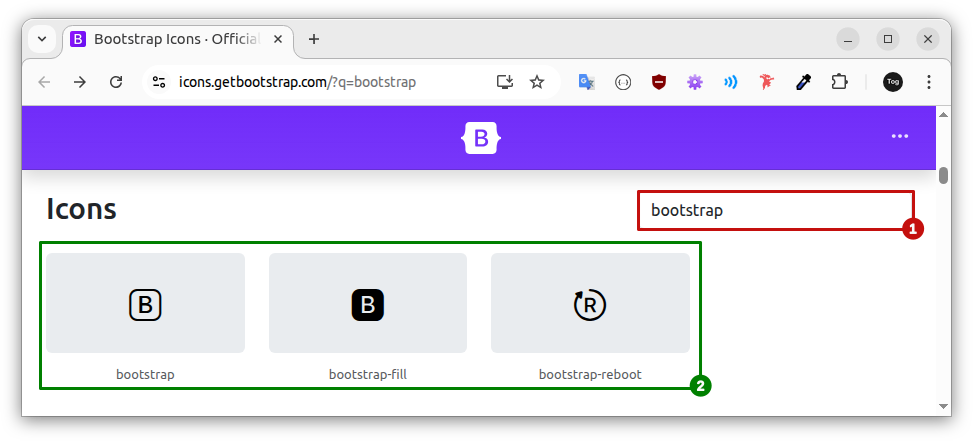
To choose an icon from the gallery, visit the Bootstrap Icons (opens in a new tab)page and type the desired name in the search box — there are more than 2000 options!
 (opens in a new tab)
User types bootstrap in the search box (1).
See all the icons in the gallery that match the search criteria (2).
After performing the search, just choose one of the returned icons and click on it to display its tag (<i>). The code below corresponds to the second returned icon (bootstrap-fill):
<i class="bi bi-bootstrap-fill"></i>The next step is to wrap the icon code in a link (<a> tag):
<a href="https://getbootstrap.com/">
  <i class="bi bi-bootstrap-fill"></i>
</a>
From now on, the icon above behaves as a clickable button; however, it is important to note that:
- The created button has only two tags: <a> and <i>.
- The <a> tag contains only one attribute: href.
- The <i> tag contains only one attribute: class.
- Each attribute has a short value:
https://getbootstrap.com/
bi bi-bootstrap-fill
🔎 But in a Real Project…
However, in a real project, things are not so simple. First, the <a> tag usually has many attributes: class, href, target, rel, aria-label, title, data-bs-toggle, data-bs-title, data-bs-placement, data-bs-offset, data-bs-template, data-bs-custom-class and data-bs-custom-trigger.
In addition, the value of each attribute also increases the size and the complexity of the tag.
If the website or application supports internationalization, some values come from properties files and are accessed through GET methods of a Model or DTO object. In these cases, the method call is usually longer and more complex. Example:
data-bs-title="<?= $pageConfig->getProperty('copy-code-button.additional-information') ?>"
(PHP code example)
This way, without the proper technique, creating tooltips can make the code chaotic and hard to manage. For this reason, the Test Page buttons that use icons were built with the following structure:
In pink, the Icon Buttons structure of the Test Page.
In orange, the Bootstrap tooltip attribute added to the structure.
The image below shows the real code of an Icon Button from the Test Page. The red arrow points to the area reserved for the Bootstrap tooltip attributes:
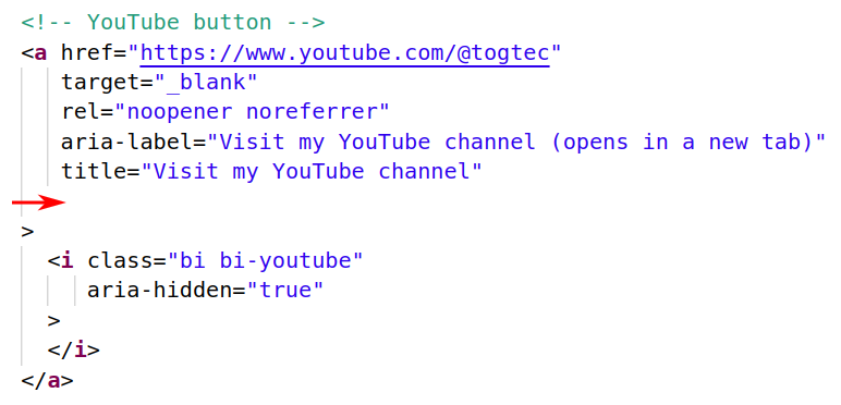
- The href attribute defines the button's destination. In the example above, it points to the togtec YouTube channel.
- The attribute-value pair target="_blank" ensures that the link opens in a new browser tab.
- The attribute-value pair rel="noopener noreferrer" is related to security and must be added to every link that points to an external page.
- The aria-label attribute defines the text that will be read by the screen reader.
- The title attribute defines the message that will be displayed to users with JavaScript disabled in the browser — users with JavaScript enabled will see the message defined in the Bootstrap tooltip.
- The attribute-value pair aria-hidden="true" indicates to the screen reader that the element should be ignored — in this case, the icon is purely decorative, since the accessible information is already provided in the aria-label of the <a> tag.
noopener prevents the opened page from accessing the original window.
noreferrer prevents the current page address from being sent to the destination site.
In the example above, it is important to note the message between parentheses — “opens in a new tab” — which is essential for users who rely on assistive technology to know that the link will open in a new browser tab.
🚨 Warning: The LinkedIn button tooltip is already partially implemented and functional — it will be used in the tests we will perform in Chapters 11 and 12.
When internationalizing an application, it is necessary to choose between two approaches:
- Translation plugins.
- Separate content versions.
Plugins: Translation plugins allow you to create content only once and instantly display it in multiple languages.
This is the perfect solution for the corporate world, which is always seeking productivity.
However, it offers less control, a higher risk of inaccurate translations, and difficulty in adjusting cultural nuances.
Versions: On the other hand, creating separate content versions means creating the same content multiple times — one for each language.
The process is manual and slower, but the quality is excellent!
The Flag Buttons were designed to work with separate content versions.
To create a pleasant browsing experience, the Test Page navigation bar includes two Flag Buttons that apply conditional styling, making the interface language-aware.
🔎 Step by Step
Every page declares its language in the lang attribute of the <html> tag. Based on this value, CSS conditional rules automatically apply the corresponding styles for each language:
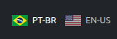
If the declared language is Portuguese: <html lang="pt-BR">
- the Brazilian flag receives opacity: 1 — appearing “on”
- the US flag receives opacity: 0.7 — appearing “off”
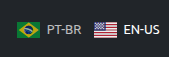
If the declared language is English: <html lang="en-US">
- the Brazilian flag receives opacity: 0.7 — appearing “off”
- the US flag receives opacity: 1 — appearing “on”
The code below defines the visual behavior of the flags based on the page language and user interaction:
/*** flag animation (turn on/turn off) ***/
  .flag-container .brazil, .flag-container .us  {
    transition: opacity 0.3s ease;
  }

  /* initial state by language */
  html[lang="pt-BR"] .flag-container .brazil { opacity: 1;  }
  html[lang="pt-BR"] .flag-container .us { opacity: 0.7; }

  html[lang="en-US"] .flag-container .brazil {  opacity: 0.7; }
  html[lang="en-US"] .flag-container .us { opacity: 1; }

  /* the flag under the mouse turns on */
  html[lang="pt-BR"] .flag-container a:hover,
  html[lang="en-US"] .flag-container a:hover {
    opacity: 1;
  }

  /* turn off the other one */
  .flag-container:hover a:not(:hover) {
    opacity: 0.7;
  }
/*** end flag animation (turn on/turn off) ***/
The image below shows the real code of a Flag Button from the Test Page. The red arrow points to the area reserved for the Bootstrap tooltip attributes:
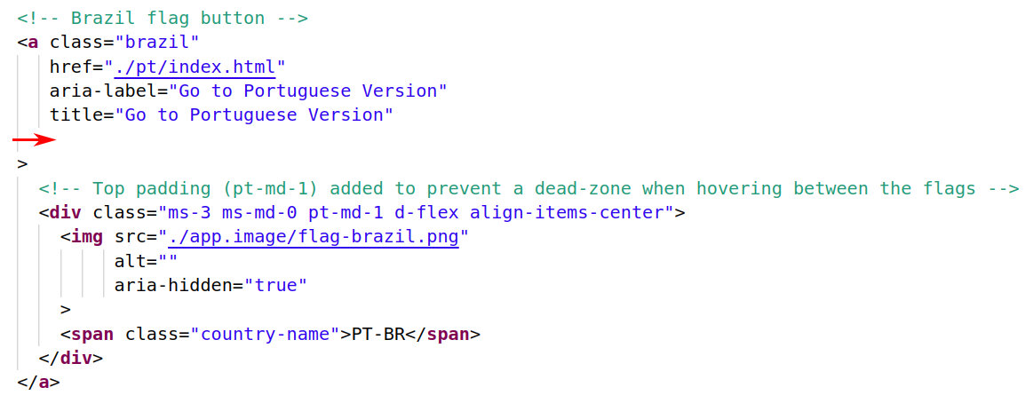
- The class attribute identifies the button, allowing CSS conditional rules to apply the styles corresponding to the page language.
- The href attribute defines the button's destination. In the example above, it points to the page that displays the Brazilian Portuguese version of the content.
- The aria-label attribute defines the text that will be read by the screen reader.
- The title attribute defines the message that will be displayed to users with JavaScript disabled in the browser — users with JavaScript enabled will see the message defined in the Bootstrap tooltip.
- The src attribute defines the address of the image file used in the button — in the example above, the Brazilian flag stored in the app.image directory.
- The alt attribute provides descriptions for screen readers and displays alternative text if the image fails to load. In the example above, it is empty ("") because:
- The aria-label attribute already provides the necessary information for assistive technologies, such as screen readers.
- The button has its own text label (“PT-BR”), which allows it to be identified even if the image fails to load.
- The attribute-value pair aria-hidden="true" indicates that the image must be ignored by assistive technologies, such as screen readers. This is a basic configuration for buttons that have visible text and purely decorative images.
According to international accessibility standards, the alt attribute must always be present, even if its value is empty.
At the beginning of the <main> tag on the Test Page, the link that leads to the Author page will be associated with a tooltip.
The image below shows the real code of the link. The red arrow points to the area reserved for the Bootstrap tooltip attributes:
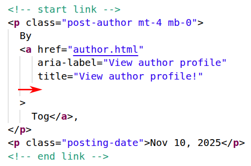
- The href attribute defines the link's destination. In the example above, it points to the English version of the Author page.
- The aria-label attribute defines the text that will be read by the screen reader.
- The title attribute defines the message that will be displayed to users with JavaScript disabled in the browser — users with JavaScript enabled will see the message defined in the Bootstrap tooltip.
👉 There is a difference in the link's code structure compared to the buttons analyzed earlier: The closing </a> tag was placed immediately after the author’s name (Tog) to prevent a line break from creating a blank space between the author’s name and the comma, when the page is rendered in the browser.
At the beginning of the <main> tag on the Test Page, after the link that leads to the Author page, there are five technology logos that will be associated with tooltips.
The image below shows the real code of a Logo from the Test Page. The red arrow points to the area reserved for the Bootstrap tooltip attributes:
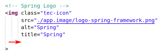
- The class attribute links the image to the tec-icon class — responsible for controlling its size, visual behavior, and animation.
- The src attribute defines the address of the image file — in the example above, the Spring Framework logo stored in the app.image directory.
- The alt attribute describes the image for screen reader users and is displayed if the image cannot be loaded.
- The title attribute defines the message that will be displayed to users with JavaScript disabled in the browser — users with JavaScript enabled will see the message defined in the Bootstrap tooltip.
🚨 Warning: The tooltips from the Angular and Linux logos are already partially implemented and functional — they will be used in the tests we will perform in Chapters 8, 9 and 13.
4. Creating a Bootstrap Tooltip
Technically speaking, a Bootstrap tooltip is created in three steps:
- Trigger definition;
- text content definition;
- initialization through JavaScript code.
For organizational reasons, this chapter covers only the trigger definition and the text content definition. The tooltip initialization through JavaScript code is addressed only in Chapter 5.
🚨 Warning: Before testing a tooltip, you must complete all three steps — otherwise, the user will see nothing!
The trigger is the HTML element that activates the tooltip. To define an HTML element as a trigger, it is necessary to add the attribute-value pair data-bs-toggle="tooltip" to the element (below, highlighted, line 2):
<a href="https://getbootstrap.com/"
   data-bs-toggle="tooltip"
>
  <i class="bi bi-bootstrap-fill"></i>
</a>
pedagogical version
(should not be tested yet)
By default, only tooltips with text content are displayed. According to the official Bootstrap documentation, the tooltip text content can be defined through the title or data-bs-title attributes.
🔎 title
The title attribute is a global HTML attribute used to provide additional information about an element.
When present, the browser can display its value when the user hovers the mouse pointer over the element.
Although it works like a native browser tooltip, it does not allow control over appearance, direction, or distance.
In addition, its display has a fixed delay (controlled by the browser), which increases the response time and gives the user a perception of slowness.
Even so, it is an interesting alternative for providing additional information to users who browse with JavaScript disabled in the browser.
🔎 data-bs-title
The data-bs-title attribute is a custom HTML data attribute interpreted by Bootstrap.
It is used exclusively by Bootstrap tooltips to define their text content.
🔎 Attribute Priority
By default, Bootstrap displays the value defined in the data-bs-title attribute inside the tooltip. However, if the trigger element does not have the data-bs-title attribute, the tooltip displays the value of the title attribute instead.
🔎 Is Using Only title a Good Idea?
At first, yes. Using only title is simpler, more practical, and more elegant — and it avoids having two attributes in the code with the same function and the same value.
However, using only title increases coupling. A Bootstrap component (the tooltip) starts to depend on a global attribute originally added to the trigger element to activate a default browser behavior (the native tooltip).
👉 If the application requirements change in the future and the title attribute is removed, the Bootstrap tooltip will also stop working!
Adopted Solution
The Test Page Project uses both attributes to define the tooltip text content:
- title to display additional information to users with JavaScript disabled in the browser — native tooltip.
- data-bs-title to display additional information through Bootstrap tooltips.
👉 Although it is possible to define different values for title and data-bs-title, in practice this does not make sense. All users should have access to the same information.
Therefore, the Test Page Project uses the same value for both attributes. This makes the code less elegant, but less coupled and easier to refactor and maintain in the future.
The code below shows a pedagogical example. The trigger definition and the text content definition are underlined in red.
<a href="https://getbootstrap.com/"
   title="Bootstrap"
   data-bs-toggle="tooltip"
   data-bs-title="Bootstrap"
>
  <i class="bi bi-bootstrap-fill"></i>
</a>
pedagogical version
(should not be tested yet)
5. Initializing the Tooltips Using JavaScript
For performance reasons, tooltips are optional and must be initialized manually. However, it is necessary to decide on which devices they will be initialized.
This decision is up to the developer, as it depends on the project's characteristics and the user profile, and it involves trade-offs (situations in which you gain something desirable while sacrificing something else of value).
To find the best solution, it is necessary to analyze some assumptions and understand the behavior of tooltips across different types of devices.
Tooltips are small text boxes associated with an HTML element — usually a link, image, or button — that are typically displayed when the user hovers the mouse pointer over the element, thus characterizing the hover state.
This improves the user experience because it allows users to understand the page elements before clicking on them.
However, touchscreen devices (such as smartphones and tablets) do not have a mouse and therefore do not provide a hover state. As a result, tooltips become less effective on these devices and may negatively affect user experience.
🔎 How a Link with a Tooltip Works
On a desktop computer, when the user hovers over an icon button, the tooltip is displayed and remains visible until the user moves the mouse pointer away from the button.
This means the user controls how long the tooltip remains visible — giving them as much time as they need to read it.
This behavior improves user experience, as users know the button’s destination before clicking it.
On a smartphone or tablet, the user can only guess the button’s destination and click it, triggering two processes simultaneously:
- The button triggers the tooltip, making it visible.
- The user is redirected to the next page.
This means that the tooltip is displayed before the next page is rendered, remaining visible for a short time — usually long enough to be noticed, but not long enough to be read.
This behavior frustrates users, leaving them with a sense of loss.
🔎 How an Image with a Tooltip Works
On a desktop computer, when the user hovers over an image with a tooltip, the tooltip is displayed; when the user moves the mouse pointer away from the image, the tooltip is hidden. It does not matter whether the user clicks or not!
This behavior gives users a sense of normality.
On a smartphone or tablet, when the image is tapped, the tooltip is displayed and remains on the screen until the user taps elsewhere.
This behavior gives users the impression that something is broken in the interface!
Initializing tooltips only on non-touchscreen devices prevents degrading the mobile user experience.
However, at the same time, it prevents additional information from being displayed to users of hybrid devices — such as laptops that support both mouse navigation and touch input.
The Test Page Project initializes tooltips only on desktop devices, ensuring an enhanced experience for desktop users without degrading the experience on smartphones and tablets.
In addition, on hybrid devices, the title attribute provides the same information as the tooltip.
🔎 Trade-offs
- Unlike the Bootstrap tooltip, the title attribute does not provide control over its appearance, direction, or offset (distance and skidding).
- Using tooltips can cause some inconvenience for users of assistive technology.
Some screen readers, for example, may duplicate or even triplicate the information provided by the tooltip, even on elements without a title attribute.
It is possible to prevent this by using only textual links, which do not require tooltips and are read only once by screen readers. However, this approach is not suitable for projects that rely on visual appeal to attract and engage users’ attention.
🔎 Code
The following code initializes tooltips only on desktop devices:
function initializeTooltipsOnlyOnNonTouchDevices() {
  // checks whether the device supports touch events
  function isTouchDevice() {
    let touch = false;

    if ('ontouchstart' in window) { touch = true; }

    if (navigator.maxTouchPoints > 0) { touch = true; }

    if (navigator.msMaxTouchPoints > 0) { touch = true; }

    return touch;
  }

  // initialize tooltips only on non-touch devices
  if (isTouchDevice()) {
    return;

  } else {
    const triggerList = document.querySelectorAll('[data-bs-toggle="tooltip"]');
    const tooltipList = [...triggerList].map(function (el) {
      return new bootstrap.Tooltip(el);
    });

  }
}

// automatically run when the DOM is fully loaded
document.addEventListener('DOMContentLoaded', () => {
  initializeTooltipsOnlyOnNonTouchDevices();
});
(located in the main.js file within the app.js directory)
👉 Between lines 1 and 26, a function named initializeTooltipsOnlyOnNonTouchDevices is declared (above, line 1).
It checks whether the device has touch support (above, line 16).
- If so, the function simply returns (above, line 17).
- Otherwise, it initializes a Bootstrap tooltip for each HTML element that contains the attribute-value pair data-bs-toggle="tooltip" (above, highlighted, line 20).
👉 Between lines 28 and 31, the anonymous function — ()=> { ... } — is registered as a listener for the DOMContentLoaded event — which is triggered as soon as the browser finishes loading and building the HTML page structure (DOM).
When the event occurs, the anonymous function is executed and calls the function responsible for initializing the tooltips (above, line 30).
If deemed necessary, the code below initializes the tooltips on all devices:
function initializeTooltipsOnAllDevices() {
    const triggerList = document.querySelectorAll('[data-bs-toggle="tooltip"]');
    const tooltipList = [...triggerList].map(function (el) {
      return new bootstrap.Tooltip(el);
    });
}

// automatically run when the DOM is fully loaded
document.addEventListener('DOMContentLoaded', () => {
  initializeTooltipsOnAllDevices();
});
To use it, copy and paste the code into the main.js file inside the app.js directory. The current file content must be removed beforehand.
6. Configuring Tooltips in the Test Page Project
Now that we have finished the JavaScript code that initializes the tooltips, we can finally configure and test the tooltips in the Test Page Project.
However, before we start, it is important to review and highlight a few points:
👉 two index pages
The Test Page Project features two index pages:
- index.html → displays the English version of the content.
- pt/index.html → displays the Portuguese version of the content.
So, for each element on the index page that shows additional information to the user, we need to configure and test two tooltips — one for each language.
👉 only English examples
This chapter shows how to configure and test only the English version of the tooltips. The Portuguese version is left to the reader.
However, if you do not speak Portuguese, do not worry. In this case, when configuring the Portuguese version, just keep the following in mind:
- All the elements in the Test Page that will be associated with tooltips already have the title attribute.
- The title attribute (already present) and the data-bs-title attribute (which will be added now) must have the same value.
Therefore, to define the text content of the Portuguese tooltip, just use the value of title in data-bs-title.
The code below configures the tooltip for the link that leads to the Author page — highlighted: the trigger definition and the text content definition:
        <!-- start link -->
        <p class="post-author mt-4 mb-0">
          By
          <a href="author.html"
             aria-label="View author profile"
             title="View author profile!"
             data-bs-toggle="tooltip"
             data-bs-title="View author profile!"
          >
            Tog</a>,
        </p>
        <p class="posting-date">Nov 10, 2025</p>
        <!-- end link -->
working version
(test on the index.html page)
To test it, add the data-bs-toggle and data-bs-title attributes, save the file, and refresh the browser window (F5).
Before configuring the Portuguese version of the tooltip, remember that the value of the title and data-bs-title attributes should be the same.
🔎 Result When Testing in the Browser
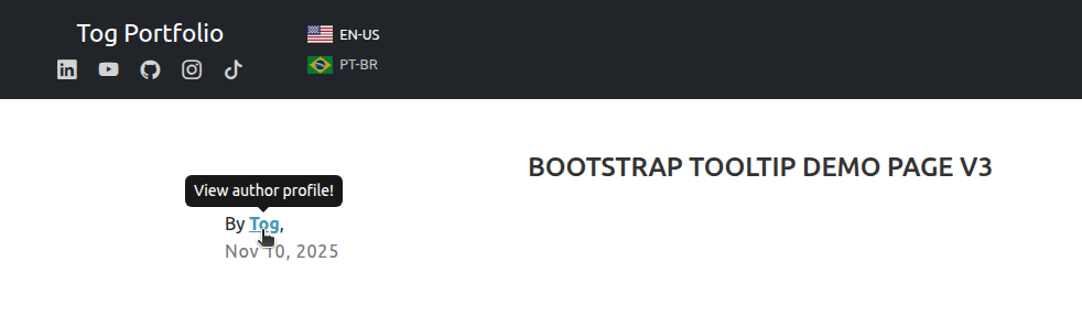
👉 Subtle colors; rounded corners; perfectly centered; positioned above the link without obstructing the content; excellent contrast — simply perfect. What could possibly go wrong?
The code below configures the GitHub button tooltip — highlighted: the trigger definition and the text content definition.
                <!-- GitHub button -->
                <a href="https://github.com/togtec"
                   target="_blank"
                   rel="noopener noreferrer"
                   aria-label="Visit me on GitHub (opens in a new tab)"
                   title="Visit me on GitHub"
                   data-bs-toggle="tooltip"
                   data-bs-title="Visit me on GitHub"
                >
                  <i class="bi bi-github"
                     aria-hidden="true"
                  >
                  </i>
                </a>
working version
(test on the index.html page)
To test it, add the data-bs-toggle and data-bs-title attributes, save the file, and refresh the browser window (F5).
Before configuring the Portuguese version of the tooltip, remember that the value of the title and data-bs-title attributes should be the same.
🔎 Result When Testing in the Browser
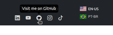
👉 A web design tragedy: it obstructs the application logo, lacks visual contrast, and is difficult to read!
In the next chapters, we will learn how to configure the appearance, direction, and distance — and turn our Bootstrap tooltips into true works of art!
7. Defining the Tooltip Direction
In the previous example, the Bootstrap tooltip for the GitHub button overlapped the navigation bar, obstructing the application logo.
The overlap also created a serious contrast issue, making the tooltip harder to see and negatively affecting the user experience.
In situations like this, the best solution is to modify the tooltip's direction using the data-bs-placement attribute, which accepts four values: top, right, bottom, and left.
Example:
- data-bs-placement="top"
- data-bs-placement="right"
- data-bs-placement="bottom"
- data-bs-placement="left"
Although the data-bs-placement attribute uses the term placement, the official Bootstrap documentation refers to these options as directions: top, right, bottom and left.
For consistency with the documentation, this article will use the term direction.
The code below defines the bottom direction for the GitHub button tooltip:
                <!-- GitHub button -->
                <a href="https://github.com/togtec"
                   target="_blank"
                   rel="noopener noreferrer"
                   aria-label="Visit me on GitHub (opens in a new tab)"
                   title="Visit me on GitHub"
                   data-bs-toggle="tooltip"
                   data-bs-title="Visit me on GitHub"
                   data-bs-placement="bottom"
                >
                  <i class="bi bi-github"
                     aria-hidden="true"
                  >
                  </i>
                </a>
🔎 Result When Testing in the Browser
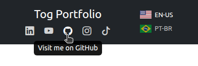
data-bs-placement="bottom"
👉 A web design tragedy: even at the bottom, the tooltip is still difficult to see!
In the next chapter, we will learn how to configure the distance between the button and the Bootstrap tooltip!
8. Controlling the Tooltip Distance
The data-bs-offset attribute controls the distance between the tooltip and the trigger element.
This attribute receives a string composed of two numbers separated by a comma as its value.
Example:
- data-bs-offset="0,8"
- data-bs-offset="0,12"
- data-bs-offset="0,21"
The first number (before the comma) is the skidding value.
The second number (after the comma) is the distance value.
👉 Skidding and distance are the terms used in the official Bootstrap documentation; the numeric values represent the number of pixels.
🔎 distance
The code below sets the distance to 21 pixels between the Bootstrap tooltip and the GitHub button:
                <!-- GitHub button -->
                <a href="https://github.com/togtec"
                   target="_blank"
                   rel="noopener noreferrer"
                   aria-label="Visit me on GitHub (opens in a new tab)"
                   title="Visit me on GitHub"
                   data-bs-toggle="tooltip"
                   data-bs-title="Visit me on GitHub"
                   data-bs-placement="bottom"
                   data-bs-offset="0,21"
                >
                  <i class="bi bi-github"
                     aria-hidden="true"
                  >
                  </i>
                </a>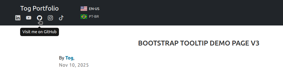
👉 Now it's simply perfect!
🔎 skidding
Skidding depends on the tooltip's direction.
If the tooltip direction is top or bottom:
- A negative value moves the tooltip to the left.
- A positive value moves the tooltip to the right.
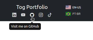
negative skidding (-30)
data-bs-offset="-30,21"
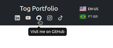
positive skidding (30)
data-bs-offset="30,21"
If the tooltip direction is left or right:
- A negative value moves the tooltip up.
- A positive value moves the tooltip down.
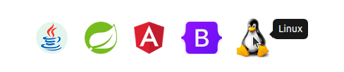
negative skidding (-12)
data-bs-offset="-12,10"
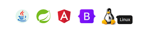
positive skidding (12)
data-bs-offset="12,10"
9. Removing the Tooltip Arrow
Bootstrap tooltips are generated from a predefined HTML template. By default, they use the following template:
<div class="tooltip" role="tooltip">
  <div class="tooltip-arrow"></div>
  <div class="tooltip-inner"></div>
</div>
Starting from the default template, you can create a version without the element responsible for rendering the arrow:
<div class="tooltip" role="tooltip">
  <div class="tooltip-inner"></div>
</div>
The next step is to transform the HTML into a string by removing the line breaks and indentation, and wrapping the code in single quotes:
'<div class="tooltip" role="tooltip"><div class="tooltip-inner"></div></div>'Once this is done, the new template can be used as the value of the data-bs-template attribute:
data-bs-template='<div class="tooltip" role="tooltip"><div class="tooltip-inner"></div></div>'
🚨 Warning: The data-bs-template attribute expects a string that defines an HTML template. Single quotes are used as a practical convention to avoid conflicts with the double quotes inside the HTML.
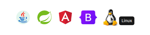
The code below recreates the last example from the previous chapter, this time building the tooltip without the arrow:
<!-- Linux Logo -->
<img class="tec-icon"
     src="../app.image/logo-linux.png"
     alt="Linux"
     title="Linux"
     data-bs-toggle="tooltip"
     data-bs-title="Linux"
     data-bs-placement="right"
     data-bs-offset="12,10"
     data-bs-template='<div class="tooltip" role="tooltip"><div class="tooltip-inner"></div></div>'
>
🔎 Result When Testing in the Browser
10. Modifying the Tooltip Appearance
Bootstrap controls the tooltip colors through two CSS variables:
- --bs-tooltip-bg — controls the background color
- --bs-tooltip-color — controls the text color
By default, the tooltip background is black and the text is white. However, you can create a custom CSS class to override these variable values.
The code below creates a custom CSS class to modify the tooltip appearance for the link that leads to the Author page:
.link-tooltip {
  --bs-tooltip-bg: #0477A2;
  --bs-tooltip-color: #FFFFFF;
}
(located in the main.css file within the app.style directory)
To use it, add the custom CSS class name to the trigger element using the data-bs-custom-class attribute. Example:
data-bs-custom-class="link-tooltip"
The code below demonstrates this:
        <!-- start link -->
        <p class="post-author mt-4 mb-0">
          By
          <a href="author.html"
             aria-label="View author profile"
             title="View author profile!"
             data-bs-toggle="tooltip"
             data-bs-title="View author profile!"
             data-bs-custom-class="link-tooltip"
          >
            Tog</a>,
        </p>
        <p class="posting-date">Nov 10, 2025</p>
        <!-- end link -->
🔎 Result When Testing in the Browser
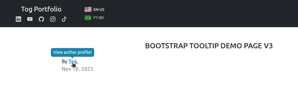
👉 The link and the tooltip now share the same color!
11. Tooltips on Links That Open in a New Browser Tab
By default, a Bootstrap tooltip is displayed in two situations:
- When the hover state occurs;
- when the focus state occurs.
Hover state: occurs when the user moves the mouse pointer over the trigger element — in this case, the tooltip becomes visible.
Focus state: occurs when the trigger element receives focus through user interaction — usually when it is reached using the Tab key or by a mouse click. In this case, the tooltip remains visible while the element remains focused.
The focus state, although essential for accessibility, can create undesirable behavior in links that open in a new browser tab.
In the example below (which can be easily replicated on the Test Page), the user moves the mouse pointer over the LinkedIn button. At this moment, the hover state occurs — the Bootstrap tooltip becomes visible and remains visible while the mouse pointer is over the button:
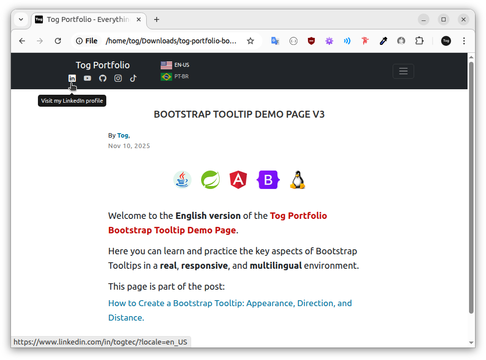
LinkedIn button tooltip on hover
In the image below, when the user clicks, the focus state occurs — from that moment, the tooltip remains visible while the trigger element remains focused (even if the user moves the mouse pointer away from the button).
However, since the button opens in a new browser tab, at first the user notices nothing strange — the user's attention is focused on the newly opened LinkedIn tab
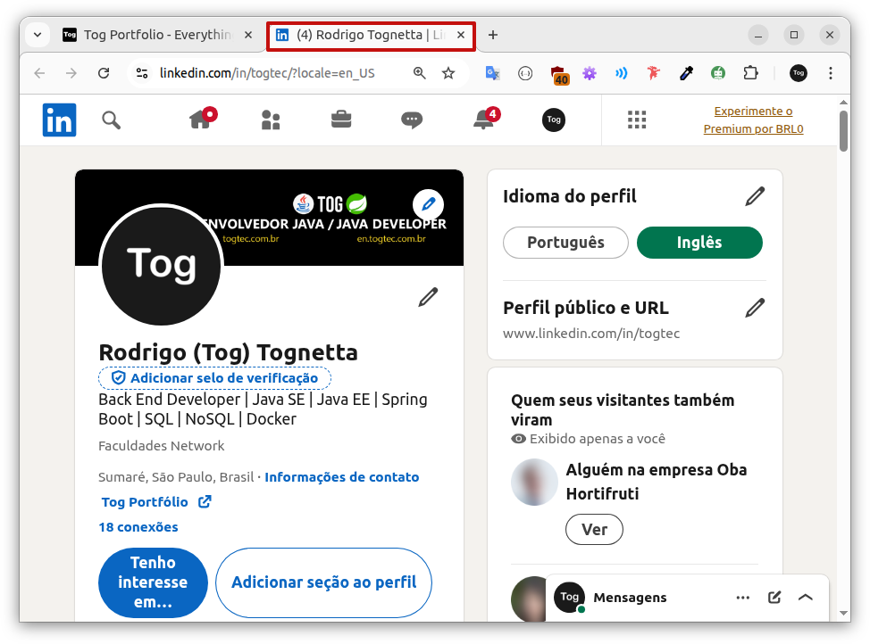
User viewing the newly opened LinkedIn tab.
After closing the LinkedIn tab and returning to the Test Page, the user notices that the LinkedIn button tooltip is still visible:
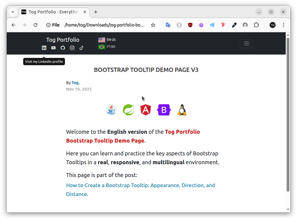
LinkedIn button tooltip on focus
Note in the image above that the mouse pointer is not over the LinkedIn button; even so, the tooltip remains visible because of the focus state — the trigger element received focus when the user clicked the button.
In this case, the tooltip remains visible until the user clicks outside the trigger element or moves focus to the next interactive element using the Tab key.
This behavior negatively affects the user's navigation experience and may cause confusion.
👉 It is important to note that the problem occurs because the LinkedIn button opens in a new browser tab — links that load content in the same tab, such as the link that leads to the Author page, do not show this behavior.
🔎 Adopted solution
Activate tooltips only in the hover state for elements that open in a new browser tab — such as the Icon Buttons on the Test Page.
To achieve this, we will add a new attribute to the trigger element: data-bs-trigger.
The data-bs-trigger attribute accepts a string that defines how the tooltip is activated. The accepted values are: manual, click, hover, and focus. Example:
- data-bs-trigger='hover focus'
- data-bs-trigger='hover'
👉 The triggers that control the tooltip display can be combined or used individually.
'manual'
Disables all automatic tooltip triggers, giving the developer full control over its display and hiding. To use it, custom JavaScript code is required to control the tooltip through the following methods:
- tooltip.show();
- tooltip.hide();
- tooltip.toggle();
This trigger cannot be combined with any other.
'click'
Shows and hides the tooltip when the user clicks on the trigger element.
'hover focus'
Default Bootstrap value — as noted previously, it may cause undesirable behavior in links that open in a new browser tab, as the tooltip remains visible after the user clicks the element due to the focus state.
'hover'
Adopted solution — triggers the tooltip exclusively on hover.
👉 Trade-off: Limiting tooltips to the hover state avoids focus-related side effects; however, it eliminates access to additional information for keyboard-only users.
The code below triggers the LinkedIn button tooltip exclusively on hover:
                <!-- Linkedin button -->
                <a href="https://www.linkedin.com/in/togtec/?locale=en_US"
                   target="_blank"
                   rel="noopener noreferrer"
                   aria-label="Visit my LinkedIn profile (opens in a new tab)"
                   title="Visit my LinkedIn profile"
                   data-bs-toggle="tooltip"
                   data-bs-title="Visit my LinkedIn profile"
                   data-bs-placement="bottom"
                   data-bs-offset="0,21"
                   data-bs-trigger='hover'
                >
                  <i class="bi bi-linkedin"
                     aria-hidden="true"
                  >
                  </i>
                </a>
To test it, simply add the data-bs-trigger='hover' attribute to the trigger element (LinkedIn button), save the file, and refresh the browser window (F5).
👉 Make sure to perform this process on both the Portuguese and English versions of the index page.
After that, when you click the LinkedIn button again, you will notice that the tooltip is no longer displayed.
12. Tooltips on Links That Open in a New Browser Tab on Touch Devices
In this chapter, we will test the solution adopted in the previous chapter on a touch device. To do so, we will learn how to use Chrome DevTools.
Google Chrome includes a set of built-in development tools known as Chrome DevTools. To access them, press F12:
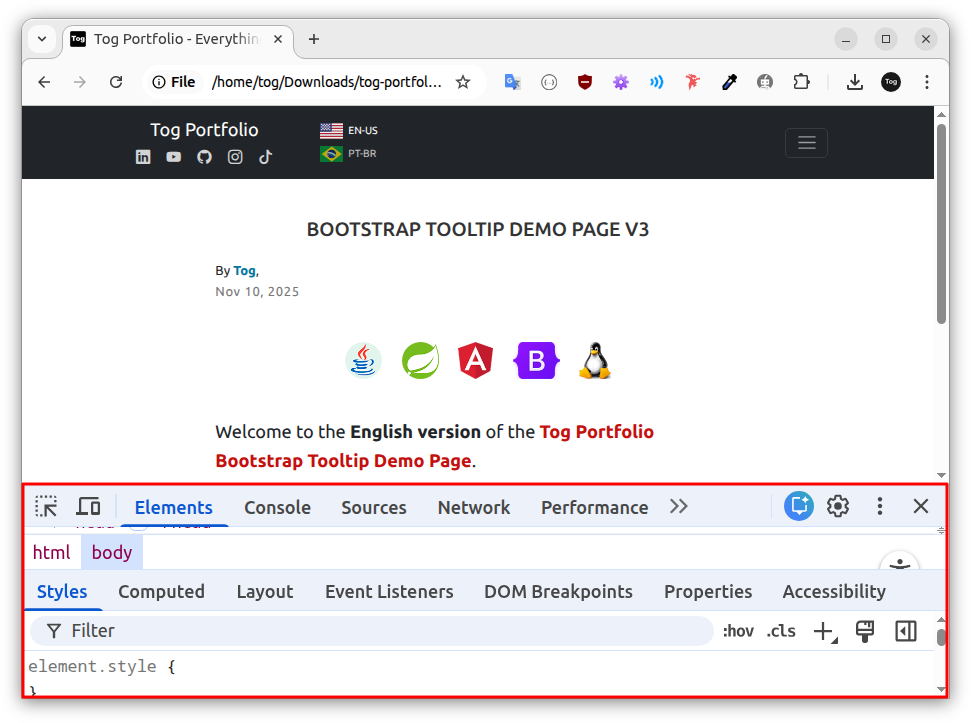
Chrome DevTools (F12).
In the image above, the active tools are highlighted in blue (Elements and Styles), while the inactive tools appear in black.
🚨 Warning: Google Chrome persistently stores the state of DevTools. This means that the browser keeps the settings from the last time you used them.
Therefore, be careful not to activate tools unintentionally. Before enabling any tool to follow an example, make sure it is not already active in your browser.
In the image below, the mouse pointer positioned over the Toggle Device Toolbar button displays its tooltip. Based on the button’s color (black), it is currently inactive.
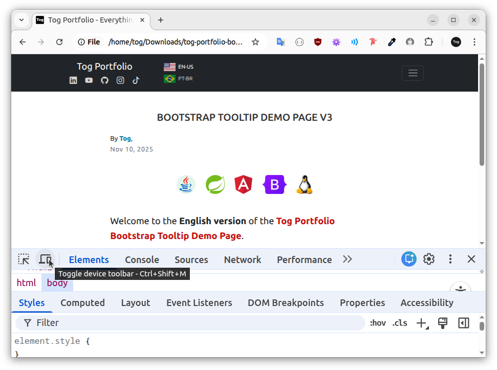
When the button is inactive, as shown above, the pointer appears as an arrow when positioned over the viewport (the upper area of the window where the page is rendered):
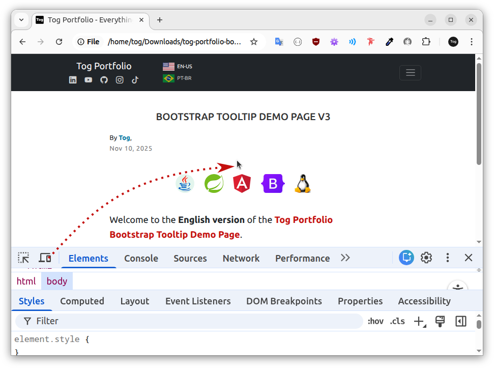
This means we are browsing in Desktop Mode (default). However, when we click the Toggle Device Toolbar button, Device Simulation Mode becomes active:
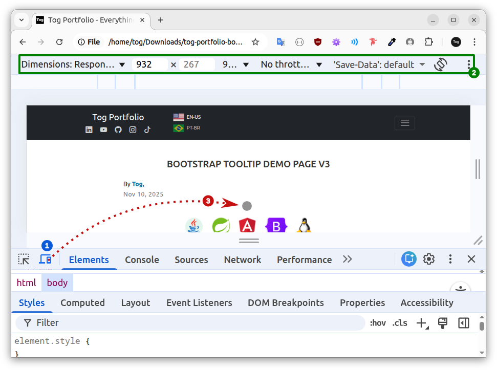
Device Simulation Mode
- In the image above, the user clicked the Toggle Device Toolbar button (1) — observe that the button is now active (highlighted in blue).
- With Device Simulation Mode active, the Device Toolbar becomes visible at the top of the window (2).
- The traditional arrow-shaped pointer is now replaced by a circular touch indicator (3), which simulates a human finger.
The device simulator allows us to test touch events and observe, in practice, how tooltips behave in a mobile environment.
Device simulation has limitations. It should be used to streamline the development process, but it does not replace testing on real devices.
Place the touch indicator (gray circle) over the LinkedIn button ():
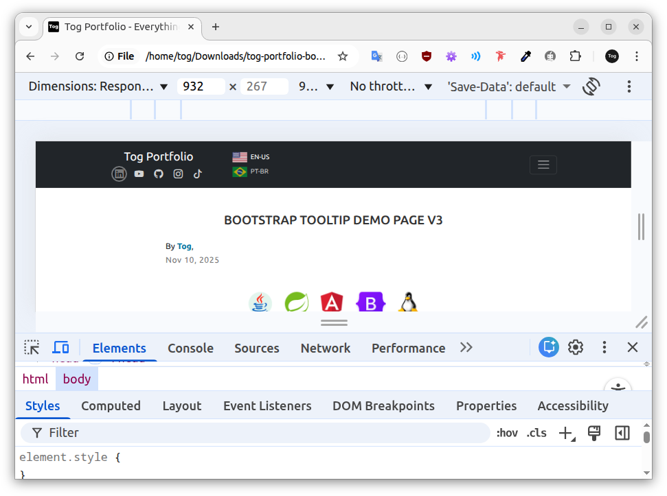
Tap to open LinkedIn in a new browser tab:
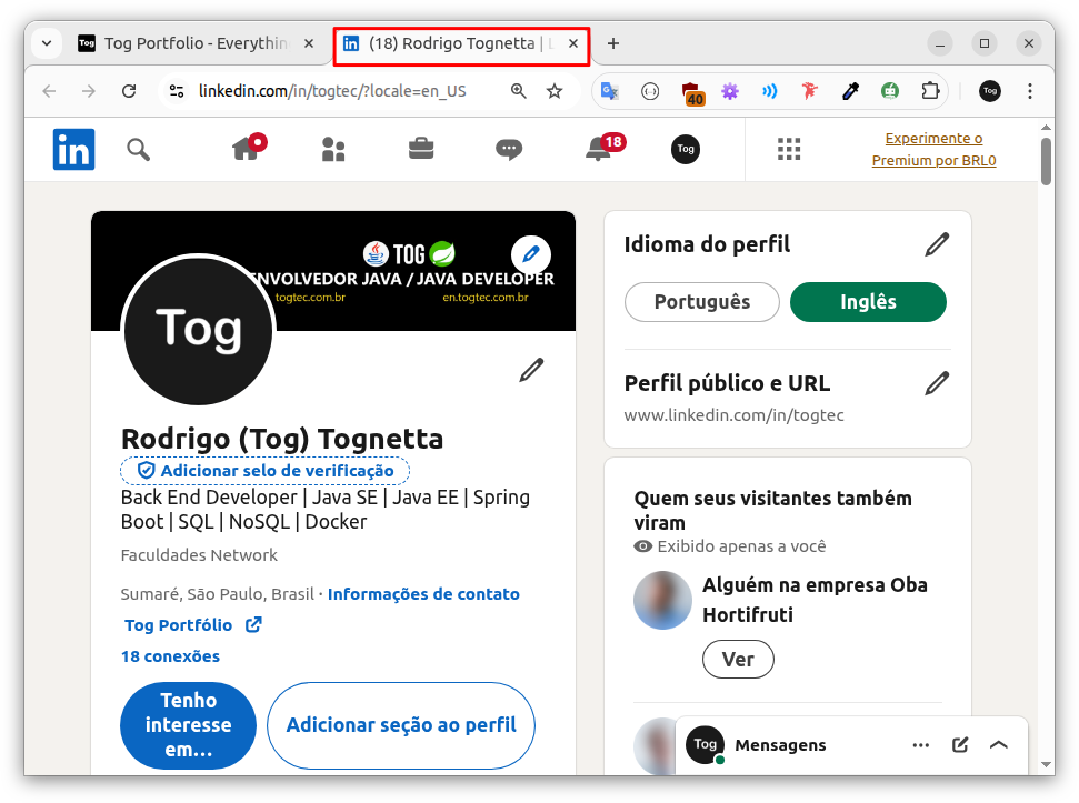
Click the close button () to return to the previous tab.
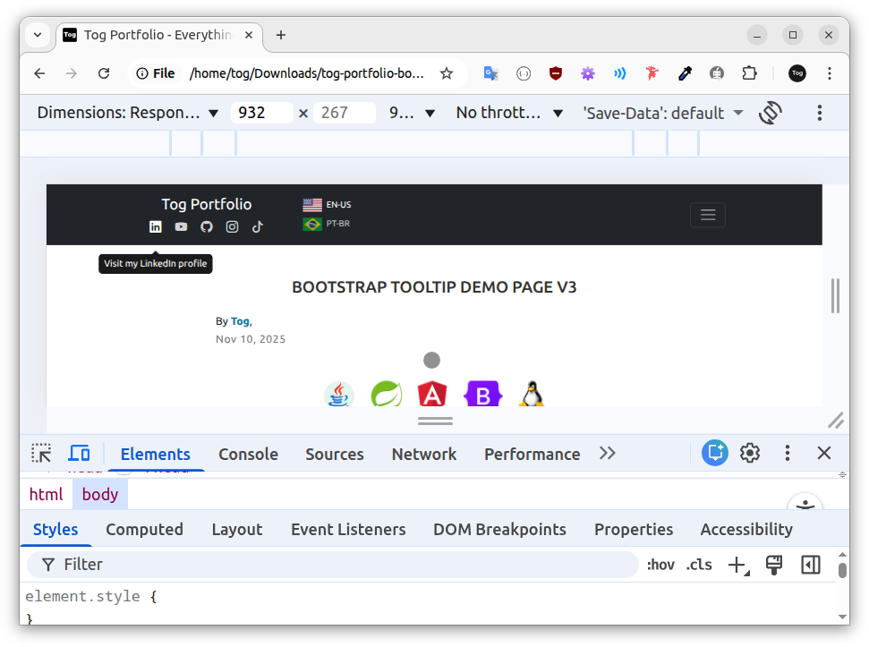
In the image above, note the unexpected behavior: the LinkedIn button tooltip remains visible. This example demonstrates two important points:
- The solution adopted in the previous chapter — triggering tooltips only on hover for elements that open in a new browser tab — is not sufficient in a mobile context.
- The solution adopted in Chapter 5 — initializing tooltips only on non-touch devices — remains necessary.
🔎 Tooltip Behavior on Touch Devices
On smartphones and tablets, tapping the LinkedIn button triggers two simultaneous processes:
- The button triggers the tooltip, making it visible.
- The LinkedIn profile loads in a new browser tab.
In a device simulator, everything happens so quickly that the user only realizes the LinkedIn button tooltip remains visible after closing the LinkedIn tab and returning to the previous tab (Test Page).
On a real touch device, mobile network delays are common. In this case, the user may notice the tooltip before the new LinkedIn tab even begins to load, making the issue even more apparent.
🤔 Why was the tooltip initialized on a touch device?
The JavaScript code in the Test Page initializes tooltips only on non-touch devices — as we saw in Chapter 5. However, in the hands-on example above, we did not test on a real touch device; we tested in a device simulator.
So, what's the difference?
When the Test Page loads on a real touch device, as soon as the browser finishes loading and building the HTML structure (DOM), the initializeTooltipsOnlyOnNonTouchDevices function is called and, after detecting that it is a touch device, simply returns without executing anything.
As a result, Bootstrap tooltips are not initialized and are never displayed — behavior already discussed in Chapter 5.
However, to load the Test Page in a Device Simulator, the following steps must be performed:
- Open the browser.
- Load the Test Page.
- Press F12 to open Chrome DevTools.
- Click the Toggle Device Toolbar button to activate Device Simulation Mode.
👉 The code responsible for initializing tooltips is executed at the end of step b. In other words, tooltips are initialized before Device Simulation Mode is activated.
🔎 Solution
The solution is to develop a small habit when working with Chrome DevTools (F12): whenever you activate Device Simulation Mode, refresh the browser window (F5).
This way, the Test Page is loaded again, and the initializeTooltipsOnlyOnNonTouchDevices function runs within the Device Simulation context.
This simple habit ensures accurate testing in both Desktop Mode (default) and Device Simulation Mode.
To verify, refresh the page (F5) and click the LinkedIn button again. The tooltip will no longer be visible when you return to the previous tab.
🚨 Warning: In a real testing scenario, sooner or later it will be necessary to disable Device Simulation Mode to test again in Desktop Mode (default).
You can disable Device Simulation Mode and return to Desktop Mode (default) in two ways:
- By clicking the Toggle Device Toolbar button;
- by clicking the Close button.
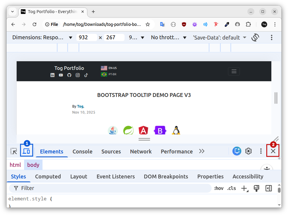
Toggle Device Toolbar button (1).
Close button (2).
After closing Device Simulation Mode — either by clicking the Toggle Device Toolbar button or the Close button — refresh the browser window (F5).
Otherwise, the displayed Test Page will remain the version loaded in Device Simulation Mode — with tooltips disabled.
👉 Only after refreshing will the Test Page behave according to Desktop Mode (default).
The Chrome DevTools is a sensitive environment that may easily lead to incorrect assumptions. Refreshing the page (F5) after any configuration change is the safest way to prevent confusion during testing.
13. Scale Transition on the Hover State
In this chapter, we will look more closely at the scale transition on the hover state of the Test Page logos. The objective is to verify how they behave in Desktop Mode (default) and in Device Simulation Mode.
Open the Test Page in a new browser window — we will test Desktop Mode (default) first.
👉 If you decide to use the browser window from the previous chapter test, close Chrome DevTools and refresh the page (F5).
Position the mouse pointer over the Angular logo:
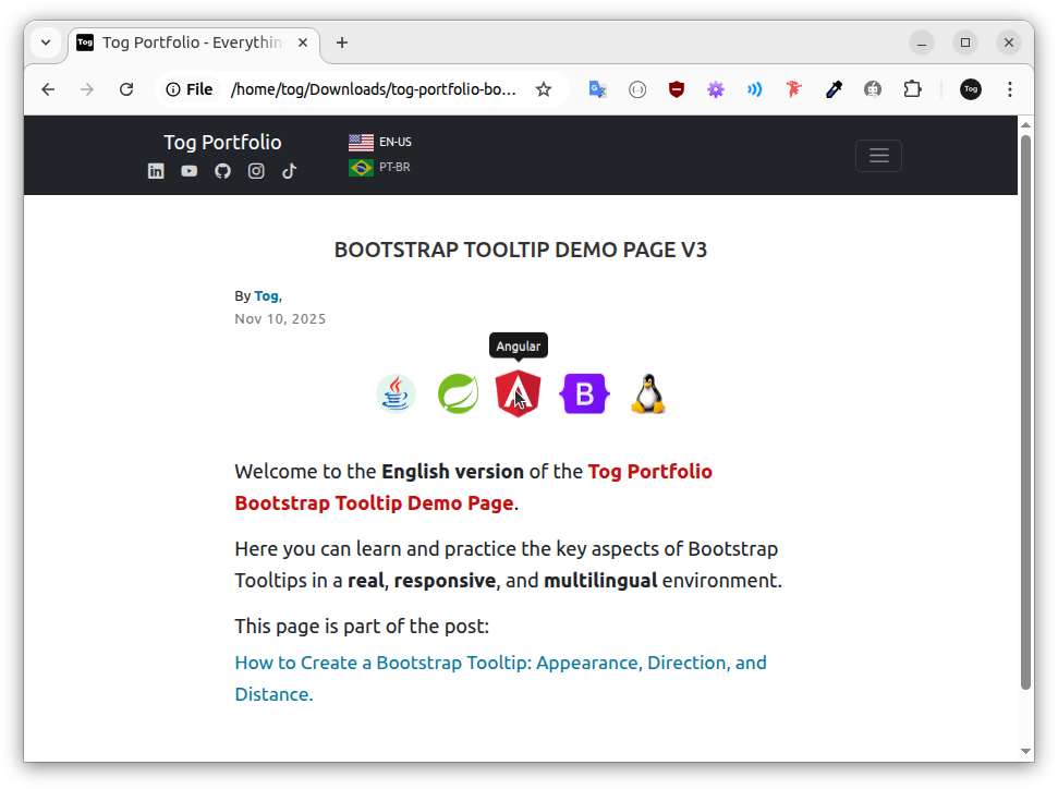
When the mouse pointer is over the logo, two processes occur simultaneously:
- The tooltip becomes visible.
- A scale transition on the hover state increases the image size:
default scale
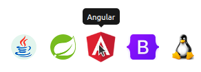
enlarged scale (hover)
👉 When you move the mouse pointer away from the Angular logo, the image returns to default scale.
On desktop, the scale transition on the hover state is perceived as a natural interface behavior.
It reinforces predictability and creates a sense of normality for the user during navigation.
Now, let's test it in Device Simulation Mode to observe its behavior on touch screens.
Press F12 to open Chrome DevTools.
Enable Device Simulation Mode — the Toggle Device Toolbar button should turn blue.
Press F5 to refresh the page — always refresh after switching modes.
Position the touch indicator over the Angular logo:
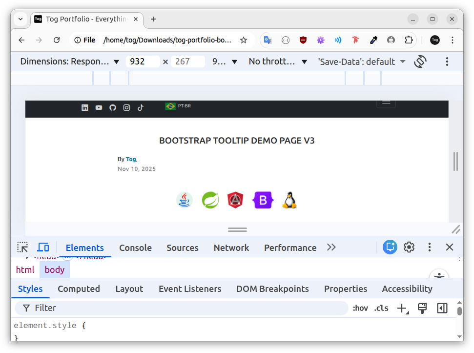
After tapping, observe that a scale transition on the hover state occurs — the image increases in size.
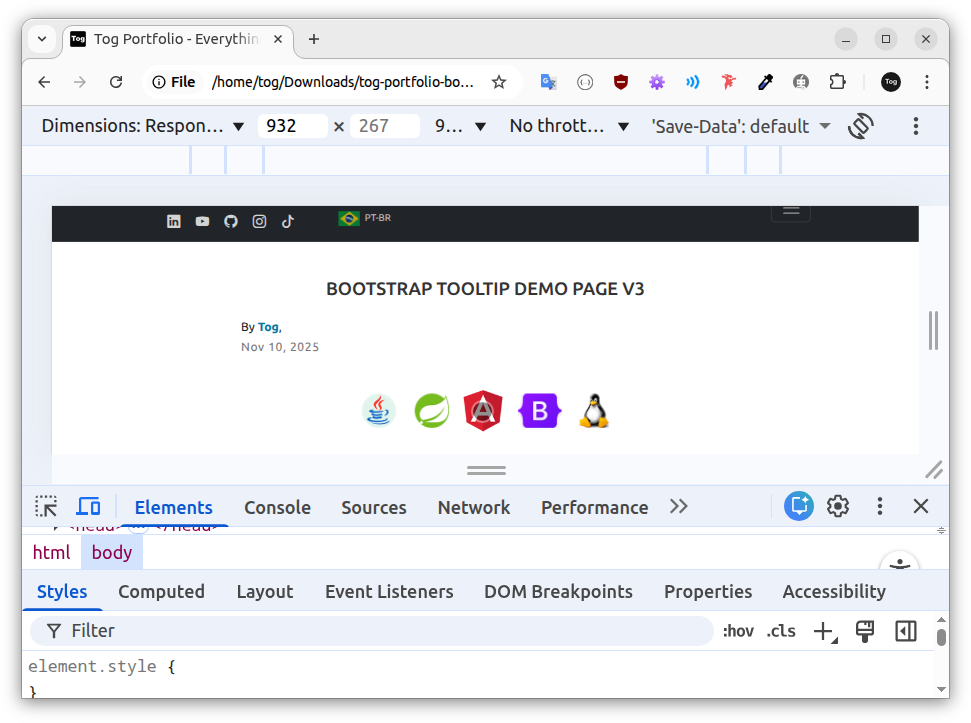
👉 After tapping a second time outside the Angular logo, the image returns to its default scale.
On touch screen devices, this behavior may give the user the impression that something is "broken" in the interface.
🔎 Solution
Disable the scale transition on the hover state for touch screen devices — the same procedure applied to Bootstrap tooltips in Chapter 5.
The Test Page logos are associated with the CSS class tec-icon, which controls their size, visual behavior, and transition:
      <!-- Angular Logo -->
      <img class="tec-icon"
           src="./app.image/logo-angular.png"
           alt="Angular"
           title="Angular"
           data-bs-toggle="tooltip"
           data-bs-title="Angular"
           data-bs-placement="top"
           data-bs-offset="0,14"
>.tec-icon-container .tec-icon {
height: 2.85rem;
width: auto;
transition: transform .3s ease;
}
.tec-icon-container .tec-icon:hover {
transform: scale(1.2);
}👉 Between lines 1 and 5, the CSS rule defines the transition applied to the HTML elements associated with the .tec-icon class:
- transition is the CSS property that defines how the transition occurs when a CSS property changes.
- transform is the CSS property that will be animated during the transition.
- .3s defines how long the transition lasts, in seconds.
- ease defines the timing function, controlling how the movement speeds up and slows down.
👉 Between lines 6 and 8, the CSS rule defines the scale change applied to the HTML elements associated with the .tec-icon class in the :hover state:
- transform is the CSS property that changes in the hover state.
- scale(1.2) is the value — it represents a 20% increase in the element's size.
To disable the scale transition on the hover state for touch screen devices, we need JavaScript code to identify this type of device and override the behavior defined in the .tec-icon:hover rule.
On touch screen devices, the value of the transform property must be changed from scale(1.2) to none !important. Example:
/* default value (desktop) */
.tec-icon-container .tec-icon:hover {
  transform: scale(1.2);
}

/* value overridden on touch screen devices */
.tec-icon-container .tec-icon:hover {
  transform: none !important;
}
The !important declaration is necessary to ensure that the rule applied on touch screen devices takes priority over the original hover rule.
In the next chapter, I provide JavaScript code to disable the scale transition on hover for logos on touch screen devices.
14. Final Considerations
Throughout 13 chapters, we learned what tooltips are and when to use them; we were introduced to the Bootstrap framework and integrated it into an HTML page; we configured the trigger and text content of the tooltips; we developed JavaScript code to initialize them only on non-touch screen devices; we understood how tooltips behave on touch screen and desktop devices; we configured direction, skidding, and distance; we created a template to remove the arrow; we modified the tooltip text and background colors; we configured tooltips on links that open a new browser tab; we tested our web application in a device simulator; and we saw how scale transitions on hover may negatively affect the navigation experience for mobile users.
👉 We accomplished all of this in a challenging, responsive, and multilingual environment: the Test Page project.
After completing the learning journey, it is now time to consolidate the knowledge you have acquired.
The Test Page project contains 26 HTML elements previously prepared to be associated with tooltips:
- 10 Icon Buttons
- 10 Logos
- 4 Flag Buttons
- 2 Links
At this point, it is essential to create your own version of a tooltip for each of these elements. Developing your own version is the best way to practice, review, and consolidate your knowledge.
Creating your own version also allows you to compare your code with that of other developers. Comparing solutions is an excellent way to improve.
The comparison process often generates new ideas and approaches and, in many cases, leads us back to a previous stage: learning.
With that in mind, I conclude this article by sharing the download link for the Test Page Project — Version 4:
Download the Test Page Project — Version 4
In Version 4, I share my own Bootstrap tooltip implementations, as well as JavaScript code that disables the scale transition on the hover state for touchscreen devices — a topic discussed in the previous chapter.
When comparing the projects, keep in mind that the objective is to present new ideas. In this context, variety and exaggeration are intentional and beneficial, as they help open new paths of thinking.
However, when developing tooltips for a real project, be discreet.
The Test Page Project — Version 4 is deliberately exaggerated for pedagogical reasons and was not created to serve as a visual design reference for commercial projects.